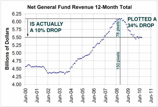
If your graphing for my class, or just in general, start your axis at zero. It seems trivial, but can have a large impact on the graph. This was apparent in a recent presentation by the Iowa Legislative Services Agency on budget revenues for the current year. Below is a graph (blue line) showing state revenues from 2000 through August 2010.
This graph shows revenues are up slightly since last year, but the level of state revenues are far below their January 2009 levels. The graph appears to show a 34% decline in total revenues. My initial reaction was “we’re really broke”. But in actuality, revenues only dropped 10% in that period. Revenues are down a little over $500 million of the high of $6 billion. The problem is their vertical axis starts at $4 billion instead of $0.
This can cause confusion for readers who visually see a large change than what actually appears in the data. It’s certainly happened before. There are some circumstances where a non-zero axis is appropriate, but not in this circumstance.
