[caption id=”” align=”aligncenter” width=”585” caption=”A One-Dimensional Approach”] [/caption]
Data visualization is great because it can merges statistics–a largely positive science–with explanation. Thus, unacquainted individuals fully into a conversation without relying on complex structures. However, I think many writers on data visualization underestimate how easy it is to forget the positive statements from statistics and turns into rhetorical statistics without a good theoretical basis.
David McCandless and Stefanie Posavec from Information Is Beautiful created an infographic of the distinction between left versus right in the United States and the European Union. Aesthetically, it’s a nice piece that tries to capture familial, economic, and social aspects of ideologies–all appropriate for analysis. However, David and Stefanie try to fit it into an antiquated one-dimension (left and right) paradigm. Some items have been debunked–for both sides–by other authors, such as Andrew Gelman’s book and his blog.
Left versus right isn’t a sufficient paradigm. In particular, the right has been wedged as a small government, psuedo-libertarian, theist-based party. But that isn’t capturing the internal structure within that dimension. It doesn’t describe big-government conservatives, staunch libertarians.
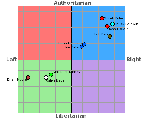
The best model for political philosophies is a two-dimensional (instead of one-dimensional) system. The diagram below from Political Compass shows the stance of beliefs in the economic realm (horizontal axis) and the social realm (vertical axis) based on the 2008 elections.
[caption id=”” align=”aligncenter” width=”480” caption=”A Two-Dimensional Approach”] [/caption]
A similar pattern is available for the European Union. David and Stefanie's take on EU political spectrum is here while Political Compass has their own take. Ultimately, this is tricky ground for infographics. David and Stefanie's analysis looks great, but it's based on a flawed model that has been adapted by others.
Via Cool Infographics via VizWorld.