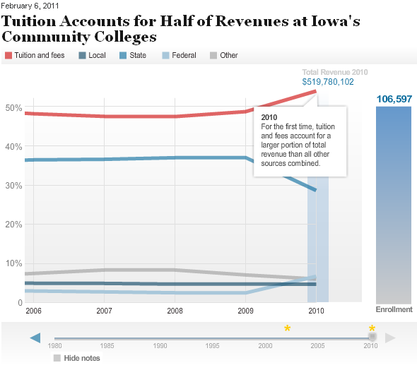
The Chronicle of Higher Education has put together an interactive chart showing tuition and fees at Iowa community colleges. Play through the timeline and you can see tuition and fees becoming a larger share of revenue for the 15 colleges, while state funding declined. There are a couple of notes along the way to highlight majors shifts.
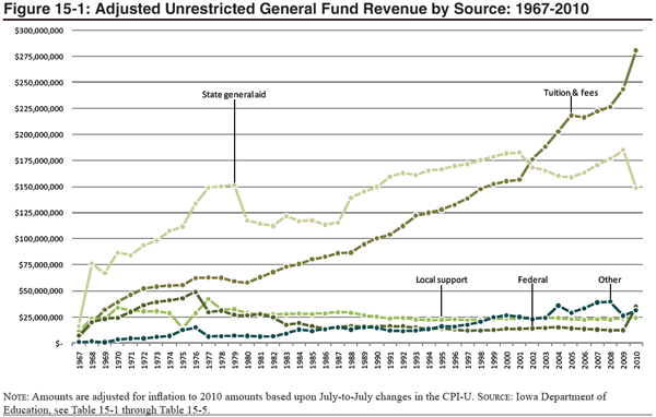
We’ve tried a few other methods to display this same data at the Iowa Department of Education. Below is a the standard image that shows up in our Tuition and Fees Report and Condition of Iowa’s Community Colleges. We use a similar, static plot, with one major difference is we plot on dollar amounts, not percentage.
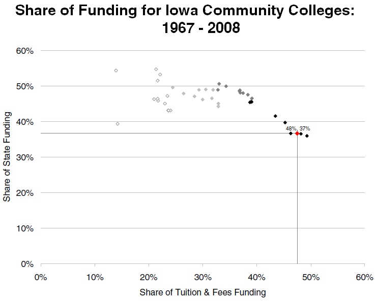
I’ve previously highlighted a Tufte scatterplot of the same data. Below we use shading to represent the approximate decade of data. The lighest points represent the 1970s, which grows darker until the black points represent the 2000s and the red point is the most recent data:
I like the interactive nature of the Chronicle data, but I don’t like that you cannot see all of the data without having to scroll. I’m not sure why the Chronicle chose to especially highlight Iowa data–it was accompanied by an article about funding in general which talked with a lot of Iowa leaders–but it is always nice to see someone else using our data.


