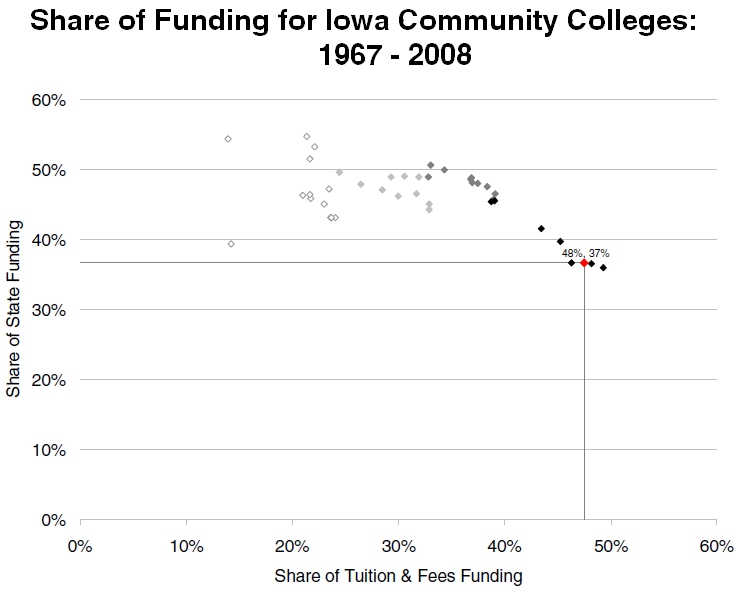
I’ve actually shown this graph before at a State Board of Education meeting last year. I don’t think it was received as well as I had hoped. Many people were worried about the “complexity” of the diagram and I did hear some murmuring when I flipped to the slide. Below is the image of the graph and a fuller explanation is below the fold:
The lightest points represent the late 60s and 70s and progressively become darker until the 2000s (black) and eventually 2008 is shown in red. This chart is an implementation of a Tufte scatter plot in Excel. The negative trend shows the share of community college funding is becoming more reliant on tuition and fees and away from state general aid–the remaining is federal, local, and other funding.
Next year there is going to be a large shift toward federal funding from the ARRA monies that supported all of education in Iowa. You can view the entire presentation here.
