How does a community college major relate to the eventual industry of employment? Now you can interact and explore the relationship between Iowa community college students and their eventual employment sector or your computer or mobile device. This is an update to a static poster I developed a couple of years ago.
There is good reason to explore data like this, both in Iowa and nationally. Education is a pathway which leads to a variety of outcomes, but arguably, career-oriented majors should lead to employment in a related sector. For the employers sake, they would probably like to hire their workers from training programs. I have previously argued that industry of employment should be a metric for accountability, particularly for career-oriented programs:
states and local regions may hope to implement new majors to develop specific industries, such as high-tech manufacturing, finance, or health. The goal of these programs is not to necessarily develop high-paying wages—although they often do—but to specifically increase the size of specific industrial sectors.
From Static to Interactive
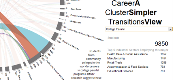
Several years ago I, with my co-author Kiyo, designed a poster using Circos to display the relationship between major and sector. The diagram, compared to a table, was more engaging than a table that consists of 17 rows and 20 columns. The left side of the diagram showed the major–the length of each bar denoting the number of students. The right side shows the industry of employment, again, the length of the bar denoting the number of students hired in each sector. The ribbons denote the number of students transitioning from majors to industries.
Most readers noted the proportion of students in each major going into specific sectors–such as a plurality of health sciences majors working in the health care sector. But another perspective shows the perspective from the employer–that most of those hired by the health care sector are not from health sciences. In some sense, it showed the demand and supply side.
But the diagram, ultimately, is static. The center diagram–in the eyes of the designer–was beautiful, but I must concede that it is complex. Readers cannot explore the data and must deconstruct the overlapping ribbons.
It was necessary to create an interactive website, first by trying to replicate the original poster layout. In this version, the reader can hover over specific major and sectors to determine the relationship and distribution between the two.
Career Cluster Transitions: A Simpler View
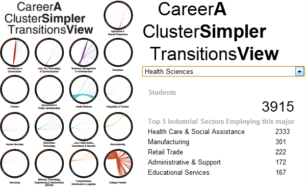
Even when we designed the original poster, we realized the difficulty reading the central diagram. We used small multiples to show each major.
[caption id=”attachment_1607” align=”alignleft” width=”600”] Original poster design (left) and new drop-down menu (right)[/caption]
Now with the interactivity, this is moot. Instead, users can choose a major from the drop-down list to see detailed information about each major. Unlike before, a reader can also see precise numbers on the number of students and their top sectors.
Data-Driven Documents
Truthfully, this is a second attempt to create an interactive version. I abandoned an attempt to create an Adobe Flash version as Flash was becoming obsolete among data visualizers. The central diagram in this webpage was created in JavaScript using the Data-Driven Documents (D3) library.
The interactive diagram is compatible with mobile devices, including iPhone, iPad, Android tablets and phones with Android 3.0+. It is compatible with Chrome, Firefox, Opera, and Safari (it is not compatible with Internet Explorer). There are no images in these documents as everything is either generated as text or Scalable Vector Graphics (SVG) so it is compatible with screen readers and is fairly accessible.
Big Picture
Take a step back and there is lots to be said, but I want to focus on what this means for big data in government. State agencies and municipal governments, arguably, have access to the biggest, most interesting data available.
In the next two decades, states will have tremendous capacity to track programs to justify their existence and to report progress. But there are two issues: (1) states generally do not have the capacity for research and (2) have a mixed record on clear communication.
The first issue could be resolved by hiring qualified researchers–there are plenty available. But the second issue is more difficult as even researchers may find it difficult to convey their findings. It will be important for governments to embrace online visualizations to allow the public to see results and explore on their own initiative.
Now that people can explore this data, the question is: how can we do it better and what other data needs to be displayed to the public?
