Edward Tufte’s The Visual Display of Quantitative Information, a key book in the area of data visualization and something that is mentioned often in this course, introduced a minimalist theory of graphs. The book, which was minimalistic in both graphing and writing, introduced new varieties of basic graphs that reduced ink usage even further.
Mr Tufte introduced a key phrase and equation that drove this desire toward minimalism, the data-to-ink ratio. In the extreme view, which Mr. Tufte assumes, lines, dots, and glyphs should not be used unless they’re instrumental to displaying data.
Column Chart
[caption id=”” align=”aligncenter” width=”307” caption=”Look ma', no lines”] [/caption]
Mr. Tufte’s approach to the column chart shows the thought process behind data-to-ink ratio. Mr. Tufte explains that to achieve high data-to-ink ratio, you must erase any lines that don’t convey data. The only ink that remains cannot be erased without losing data.
His column chart is a profound example. In our previous example we erased the unnecessary horizontal and vertical axises. Mr. Tufte also erases the horizontal lines that give perspective to the bar’s length. As a result, the column chart looks like boxes stack on top of each other, each segment of equal length.
Juice Analytics has shown how to replicate this graph in Excel. See the first table in their spreadsheet [xls].
Scatter Plots
Scatter plots are some of my favorite. Mr. Tufte has envisaged two takes on the beloved scatter plot. One I love, the other I hate.
The above scatter plot is one of my favorite graphs. The color of the point represents the era: lighter means older (beginning in the 70s), darker means recent (e.g., 2000s), and red means the most recent year. This graph displays three dimensions of data: share of funding from state, share of funding from tuition, and time.
Mr. Tufte’s second take on scatterplots extrudes extreme minimalism again. He refers to the graph below as a dot-dash-plot, minimizing the axis shown where there is corresponding data. The axis becomes a way to convey density of a single variable.
[caption id=”” align=”aligncenter” width=”308” caption=”Dot-dash-plot”] [/caption]
An example is available from Juice Analytics.
Shaded Column Chart
How do you display time-series data while highlighting certain eras? The most common example is showing historical income changes through periods of recession and economic expansion. Related applications could easily include
Sparklines
All the rage, like florescent-colored sunglasses and Vampire Weekend, sparklines are small, word-sized graphs. Dashboards usually use sparklines to convey a multitude of data in a condensed space.
Disgression on Tufte’s Minimalism
Mr. Tufte introduced revolutionary ideas in graphing. Those with a serious interest in data visualization often directly or indirectly invoke his ideas in a number of ways. But there are severe drawbacks to implementing these graphs directly–they may confuse the reader. The underlying assertion in this course is to design graphs that can be understood more clearly.
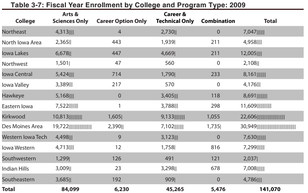
Readers, however, tend to have a basic graph to the rules of plotting. This is especially true for basic plots–bar, column, line, or even pie. Mr. Tufte changes these rules. His implementations may confuse readers, generating more questions than the worth of the graph itself. One of the best lessons are sparklines. Below is an implementation of sparklines in The Annual Condition of Iowa’s Community Colleges. We include sparklines with tables to help answer the oft-asked question: where do I rank? This is the most beloved use of data visualization techniques in reports I’ve written. It is also the most hated. Some people–including elected officials–absolutely do not like these sparklines. We keep using sparklines, but they have caused an uproar, so careful when using these techniques in practice. Trial and error.
[caption id=”attachment_607” align=”aligncenter” width=”600” caption=”Quite the furor”] [/caption]
In presentations or reports, Tufte-style basic plots may only frustrate the reader, causing less understanding on the simplest of points. Ultimately, you will need to think of your reader and work within those limits. Indeed, his approach to graphing may have only been to introduce new ideas, to exhibit extreme minimalism to highlight the need for better graphs. It may be undue to criticize his graphs as potentially confusing since, like many artists, he need to go a step to far to push his main point: get rid of chart junk, emphasize the data, and do what is needed to tell the story.